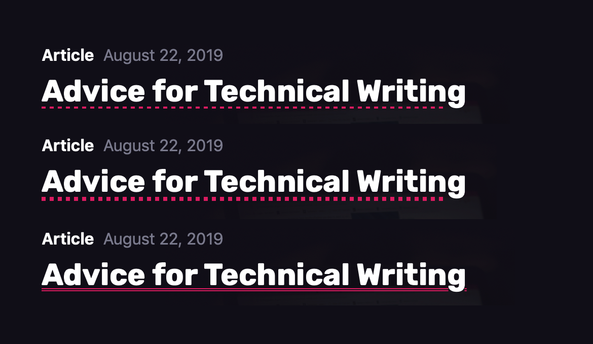
Before we come to how to style underlines, we should answer the question: should we underline?
In graphic design, underlines are generally seen as unsophisticated. There are nicer ways to draw emphasis, to establish hierarchy, and to demarcate titles.
That’s clear in this advice from Butterick’s “Practical Typography”:
If you feel the urge to underline, use bold or italic instead. In special situations, like headings, you can also consider using all caps, small caps, or changing the point size. Not convinced? I invite you to find a book, newspaper, or magazine that underlines text. That look is mostly associated with supermarket tabloids.
But the web is different. Hyperlinks are the defining feature of the internet; and from the internet’s inception, they have been underlined. It’s a universally understood convention. The meaning is crystal clear — an underline means a link.
However, plenty of popular websites have ditched underlines: The New York Times, New York Magazine, The Washington Post, Bloomberg, Amazon, Apple, GitHub, Twitter, Wikipedia. When they removed underlines from their search results page in 2014, Google lead designer Jon Wiley argued that it created a cleaner look. Notably though, the majority of these sites have kept slight variances on the traditional lurid blue color (#0000EE) that’s been the browser default since the beginning of the web. While this provides a visual cue for the majority of users, it may not be enough to pass WCAG accessibility compliance.
Color is not used as the only visual means of conveying information, indicating an action, prompting a response, or distinguishing a visual element.
— WCAG 2.1
WCAG do not strictly mandate using underlines for links, but it does recommend them. Color blind users need to be able to discern a link. You could differentiate them in other ways, such as with a bold font-weight. Or you could keep this long-established visual affordance. But if we’re going to use underlines, we want them to look nice. Marcin Wichary, a designer at Medium, described the perfect underline as:
[…] visible, but unobtrusive — allowing people to realize what’s clickable, but without drawing too much attention to itself. It should be positioned at just the right distance from the text, sitting comfortably behind it for when descenders want to occupy the same space.
Achieving this has traditionally required CSS tricks.
The hacks we’ve had
This is one trick all developers will be familiar with: border-bottom. By emulating an underline using border-bottom, we gain control over color and thickness. These pseudo-underlines have one problem: an overly large distance from the text. They are underneath the descenders of the letters. You could potentially solve this issue by using line-height, but that comes with its own issues. A similar technique utilises box-shadow. Marcin Wichary pioneered the most sophisticated technique, using background-image to simulate an underline. They were useful hacks but are thankfully no longer needed.
Styling real underlines
Finally we can demarcate links without sacrificing style thanks to two new CSS properties.
text-underline-offsetcontrols the position of the underline.text-decoration-thicknesscontrols the thickness of underlines, as well as overlines, and line-throughs.
According to the WebKit blog:
You can also specify
from-fontto both of these properties which will pull the relevant metric from the used font file itself.
UX agency Clearleft make bold use of (pseudo) underlines, calling clear attention to links with colorful styling. Here’s one example of a faux underline:
a {
  text-decoration: none;
  border-bottom: #EA215A 0.125em solid;
}
Notice that this fake underline is clearly below the descender of the letter “y”:
Here’s the same paragraph, using DevTools to apply the same styling to a real underline using the new CSS properties:
a {
  text-decoration-color: #EA215A;
  text-decoration-thickness: .125em;
  text-underline-offset: 1.5px;
}
You’ll notice I’m using the em unit in my example code. The spec strongly encourages using it rather than pixels so that the thickness scales with the font.
These properties have already shipped in Safari and are coming in Firefox 70.
With the move to Chromium for Microsoft’s Edge browser, we will finally have cross browser support for the text-decoration-style property, which offers the options: solid (the default), double, dotted, dashed, and wavy. When combined, these new properties open up a whole range of possibilities.

Perhaps the biggest upgrade for underlines on the web, however, has come without developers needing to do anything. In the bad old days, descenders were unceremoniously sliced through by underlines, which was far from elegant. Developers used to hack around this shortcoming by applying a text-shadow that matched the background color. text-decoration-skip-ink brought a better way to make space for descenders.

Handily, it’s set as the new default value for underlines; meaning the look of underlines has improved while most web developers remain unaware that this property exists. Should you want an underline to cross over glyphs, you can set this property to none.
The post Styling Links with Real Underlines appeared first on CSS-Tricks.
0 Comments