You work a while on a side project. You think it’s pretty cool! You decide to release it into the world. And then… it goes well. Or it doesn’t go well. Wait, is that right? You forgot to add analytics — it just didn’t cross your mind at the time. Now you’re pretty curious how many people have been visiting the site, but… you’re not sure. Enter Netlify Analytics.
There are so many times where I:
- Forget to add analytics
- Don’t want to incur the extra page weight, or
- I’m concerned with privacy issues
I released a CSS Grid Generator last month and I forgot to add analytics. The release went well, but now it’s a bit of a black box for me as far what happened there or if I need to adjust a release in the future. Now, however, I can enable Netlify Analytics and see into the past without having lost any information. Sweet.
Netlify Analytics doesn’t have a ton of bells and whistles — it’s not meant to be a replacement for super comprehensive marketing tools. But if you want to get some data about your site without adding a lot of scripts, it can be a handy tool.
One really nice thing about it is the accuracy. Since the data is coming from the server, you can have a clear picture of what the server actually served, rather than relying on a third party which might have varied reporting due to things like add blockers that can skew client-side reporting (15% of users are estimated to use tools like Ghostery, for instance), caching, and other factors.
The Analytics Dashboard
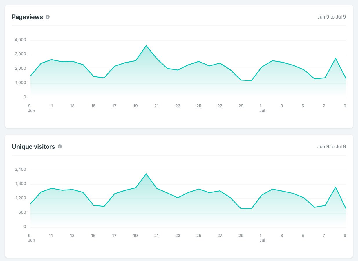
The dashboard for each site shows some “at a glance” information:
Then you can dive into more detailed information by specific date:

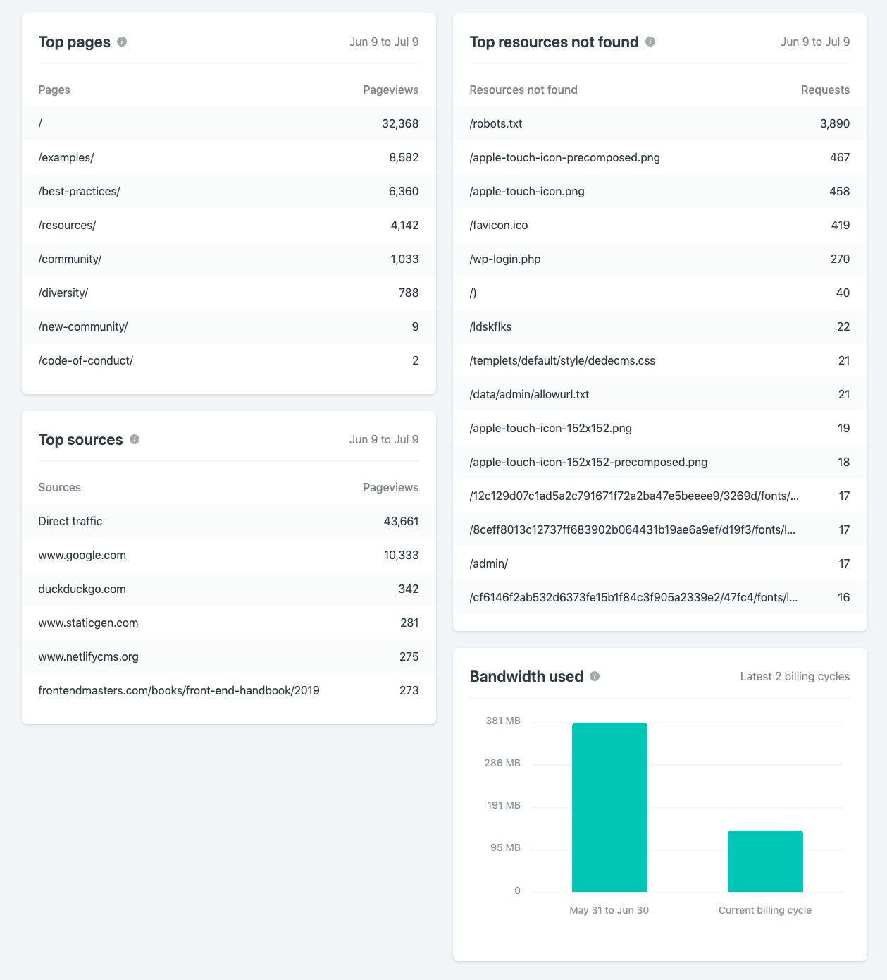
There’s a bit of information from top sources and top pages:

There’s an area for “Top Resources Not Found”, which shows any pages, images, anything that your visitors are trying and failing to retrieve from your site. When I enabled it on mine, I was able to fix a broken resource that I had long forgotten about.
It’s going to be awesome being able to check how some of my dev projects are doing. But I’m also really excited to take that extra implementation step out of my work. The caveats to keep in mind is that your site needs to be hosted by Netlify in order to use the Analytics tools, and it’s a paid feature. Any site you enable will show up to 90 days (3 billing cycles) in the “Bandwidth used” chart, and up to 30 days in all other charts if it’s old enough, however it could take up to 2 days between when you enable analytics and when your dashboard is calculated and populated.
Under the hood
The analytics dashboard itself is built with React and Highcharts. Highcharts is a JavaScript charting library that includes responsive options and an accessibility module. All of the components consume data from our internal analytics API.
Before development began, we conducted an internal comparison survey of data visualization libraries in order to choose the best one for our needs. We landed on Highcharts over other popular options like d3.js, primarily because it means any engineer at Netlify with JavaScript experience can jump in and contribute, whether they have deep SVG and D3-specific knowledge or not.
While the charts themselves are rendered as SVG elements, Highcharts allows you to render any text inside the graph using HTML, simplifying and speeding our development time and allowing us to use CSS for advanced styling. The Highcharts docs are also top notch and offer a ton of customization options through their declarative API.
We used the Highcharts wrapper for React in order to create reusable React components for each type of graph. The “Top sources,” “Top pages,” and “Top resources not found” cards use a different component that displays a


0 Comments