December 6th, 2018 was a special date for WordPress: it marked the release of version 5.0 of the software that, to this day, powers more than one-third of the web. In the past, people working on the platform pointed out that there has never been any special meaning to version numbers used in WordPress releases; as such, WordPress 5.0 was simply the follower to WordPress 4.9. Yet, 5.0 brought possibly the biggest innovation since Custom Post Types were introduced in version 3.0 – that’s almost a decade, folks.
The Block Editor — codename “Gutenberg” — is now the new default writing tool in WordPress. Before its adoption in Core, our beloved CMS has relied on what we now call the Classic Editor. And, by the way, the Classic Editor isn’t really gone: you can bring it back by installing a plugin that restores the default editing experience you’ve known all these years.
So, why was the Classic Editor replaced? Essentially because it embodied an old concept of writing, a concept that was conceived when the only need of a text editor was to visually compose HTML code.
Not to create layouts. Not to embed dynamic content form heterogeneous sources. Not to offer a representation of what your post or page would look like when you pressed that “Publish” button, and go live with your piece of content.
In short, the Classic Editor delivered a very basic writing experience and, frankly, it always fell short at creating anything more than flowing text.
The Block Editor is based on the idea of content “blocks” in the sense that everything we can add to a page — a text paragraph, an image, an embed — is technically a block, that is, an atomic entity that’s defined by a certain series of properties. The combination of these properties determines the state of that particular block. Combine several blocks one after the other, and you’ll get the content of your page.
In this transition from unorganized text to rigorous content structure lies the biggest change introduced by the Block Editor.
Layouts pre-Block Editor
Before all of this bursted into existence, people who wanted to create a layout within WordPress had to choose between either of these options:
- Create a custom template from scratch, getting their hands dirty with code – a noble intent, yet not so appealing to the masses.
- Use a tool, better if a visual one, that helped them composing a page structure without having much code knowledge.
That’s how page builders were born: page builders are plugins that provide a visual way to compose a layout, ideally without touching a single line of code, and they were created out of necessity to fill a gap between visual mockups and the actual, finished website.
Page builders have always suffered from a bad reputation, for a variety of reasons:
- They tend to be slow and bulky.
- Some offer poor editing experiences.
- They end up locking users into a framework or ecosystem that’s tough to replace.
The first point is as obvious as it is unavoidable: if you’re a page builder author (and, hopefully, aspire to sell copies of your product), you have to make it as appealing as possible; physiologically, builders started to slowly become big code soups with everything in them, at the detriment of performance.
The second point may be subjective, at least to to some extent. The third point, however, is a fact. Sure, one could be perfectly fine using the same tool for every project, perfecting knowledge of the instrument as time goes by, but the more you stick to it, the harder it gets to potentially stop using it one day.
The Block Editor aims to surpass this deadlock: from the user’s point of view, it aims at offering a better, richer writing experience, while, from the developer’s perspective, providing a unified, shared API from which to build upon.
A brief history of CSS layouts
If you’re old enough, you’ll probably know the story already. If not, it might be fun for you to hear what life was like for a front-end developer back in the day.
The first version of the CSS specification dates back to 1996, and it allowed an embedded stylesheet to add font styling, pick colors for elements, change the alignments and spacing of objects in the page. The problem was that, in those days, the concept of semantic HTML wasn’t exactly widespread. In other words, there was no clear separation between content and form. The markup we’d write and the appearance we want were completely intertwined in the same document.
This led to HTML elements to be used more for presentation purposes, than conveying meaning to their presence in the page. For example, on the layout side of things, this also led to to table elements being used to create layouts instead of actual tabular data. To achieve even more complex layouts, tables began being nested into other tables, making the page become a nightmare from the semantic point of view, its size grow and grow, and resulting very hard to maintain over time. If you’ve ever coded an HTML email, then you have a good idea of what life was like. And, really, this still sort of happens in websites today, even if it’s for smaller elements rather than complete page layouts.
Then the Web Standards movement came along with the goal to raise awareness among developers that we could be doing things differently and better; that style and content should be separated, that we need to use HTML elements for their meaning, and reinforcing the concept that a lighter page (in terms of code weight) is a fundamentally better option than an unmanageable ocean of nested tables.
We then began (over)using div elements, and juxtaposed them using the float property. The presentation focus was shifted from the markup to the stylesheet. Floats became the most reliable layout tool available for years, yet they can be a bit problematic to handle, since they have to be cleared in order for the page to return to its standard flow. Also, in this age, page markups were still too redundant, even though using divs instead of tables helped make our content more accessible.
The turnaround moment came in 2012, with the publication of the Flexbox specification. Flexbox allowed developers to solve a whole series of long standing little layout problems, complete with an elegant syntax that requires a lot less markup to be implemented. Suddenly (well, not that suddenly, we still have to care about browser support, right?), reliably centering things on both axises wasn’t an issue anymore. It was refreshing. Finally, tweaking a layout could be reduced to altering just one property in our stylesheet.
As important as Flexbox is to this day, it is not the end of the story.
It’s 2019! Let’s use CSS Grid.
If you’ve come this far reading this piece, we think it’s safe to assume that two things are for sure:
- That we clearly aren’t in this industry to live peaceful, quiet professional lives.
- The things we use are going to change.
In 2017, the CSS Grid Layout Module specification was officially published, but, as it always happens with CSS specs, its draft and interim implementations had already been around for some time.
CSS Grid is a bold leap into what CSS can and should do. What if we stopped micromanaging our pages styles, and started thinking more holistically? What if we had a system to reliably position elements on the screen that doesn’t depend at all on the markup being used, nor the order of elements, and that is, at the same time, programmatically applicable on smaller screens?
No, this isn’t just a thought. This is more of a dream; one of those good ones you don’t want to wake up from. Except that, in 2019, this has become a reality.
The main difference between Grid and Flexbox is more nuanced, of course, but basically comes down to Grid operating in two dimensions, while Flexbox is limited to one. Knowing what elements are going to be placed within the limits of a container, we can choose exactly where those elements are going to end up, entirely from directives written in the stylesheet.
Do we want to tweak the layout down the road? Fine, that modification won’t affect the markup.
The basic idea behind Grid is that elements are laid out in, well, a grid. By definition, a grid is composed by a certain amount of columns and rows, and the boundaries between columns and rows form a series of cells that can be filled with content.
The savings of this approach in terms of quantity of code being used to achieve the desired result are extraordinary: we just need to identify a container element, apply the display: grid rule to it, and then pick elements within that container and tell CSS what column/row they begin/end in.
.my-container {
  display: grid;
  grid-template-columns: repeat( 3, 1fr );
  grid-template-rows: repeat( 2, 1fr );
}

.element-1 {
  grid-column-start: 2;
  grid-column-end: 4;
  grid-row-start: 1;
  grid-row-end: 3;
}
The above example creates a 3×2 grid associated to the .my-container element; .element-1 is a 2×2 block that is inscribed in the grid, with its upper left vortex being positioned in the second column of the first row of the grid.
Sounds pretty neat, right?
The even neater thing about CSS Grid is the fact that you can create template areas, give those areas meaningful names (e.g. “header” or “main”), and then use those identifiers to programmatically position elements in those areas.
.item-a {
  grid-area: header;
}
.item-b {
  grid-area: main;
}
.item-c {
  grid-area: sidebar;
}
.item-d {
  grid-area: footer;
}

.container {
  display: grid;
  grid-template-columns: 50px 50px 50px 50px;
  grid-template-rows: auto;
  grid-template-areas:
    "header header header header"
    "main main . sidebar"
    "footer footer footer footer";
}
For those who have begun working in this business in the tables era, the code above is nothing short of science fiction.
More good news, anyway: support for CSS Grid is pretty great, today.
Using CSS Grid in WordPress
So, this is great, and knowing that we can do so many more things today than we could compared to a few years ago probably makes you want to give Grid a try, at last.
If you are working on a WordPress project, you’re back facing the two options mentioned above: do we start from scratch and manually coding a template, or is there something that can give us a little help? Luckily, there is a plugin that might interest you, one that we have created with a dual goal in mind:
- Create a bridge between the Block Editor and CSS Grid.
- Create a plugin that could perhaps make people move past the initial skepticism of adopting the Block Editor.
It’s called Grids, and it’s a free download on the WordPress plugins repository.

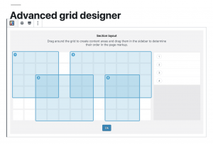
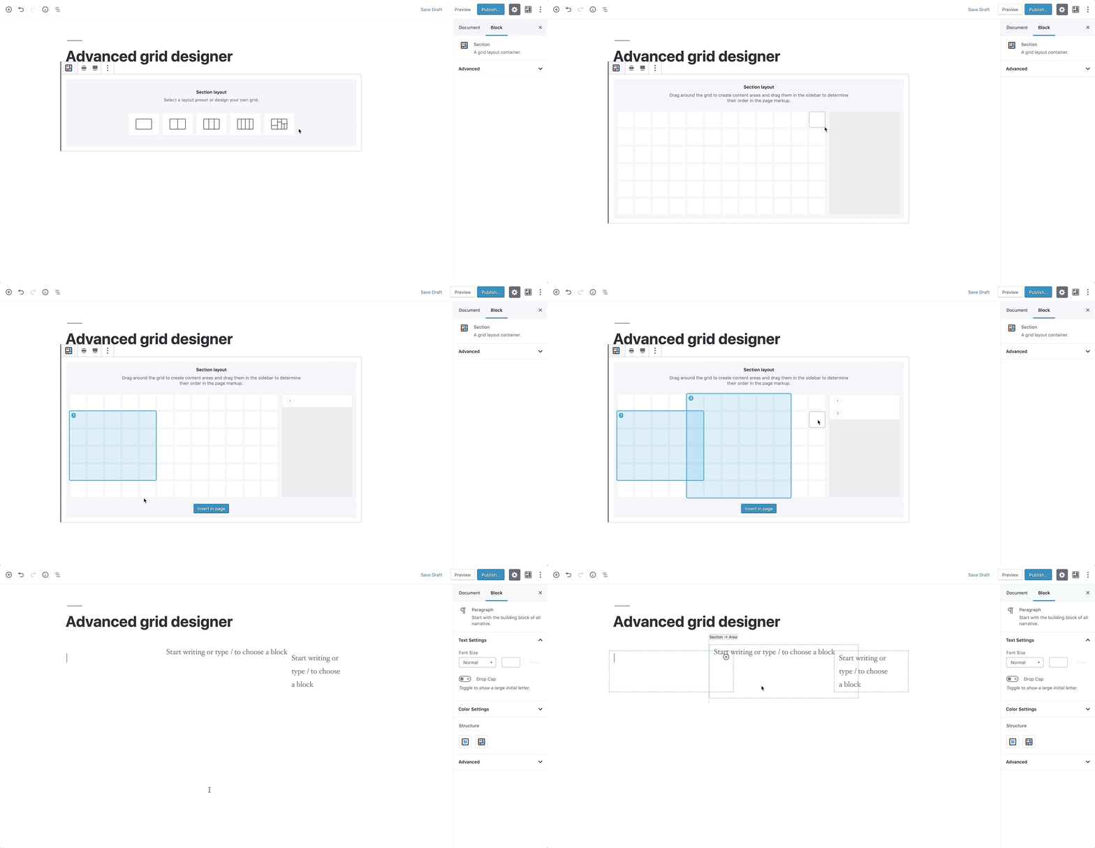
Grids only takes care of the layout structure. It puts a 12×6 grid at your disposal (called Section), over which you can drag and draw the elements (Areas) that are going to be contained in that Section.
The system allows you to manually specify dimensions, backgrounds, responsive behavior, all using visual controls in the Block Editor, but by design, it doesn’t provide any content block. Sure, one could see this approach as a weak point, but we think it’s actually Grids’ biggest strength because it enables the plugin to integrate with the myriad content blocks that other developers all around the world are creating. More so, in a way Grids helps bringing those blocks, and WordPress as a platform, in touch with CSS Grid itself.

Yet, even if the plugin doesn’t strictly produce content, it’s inevitable to put it in the same phrase with successful page builders, in fact comparing its functionality to that offered by those. If you care about concepts like separation of form and content, page weight, ease of maintenance, Grids offers a cleaner solution to the problem of creating visually appealing layouts in WordPress.

The generated markup is minimal. In its most basic form, a Section (that is, the element with the display: grid property) is only composed by its own element — of course, an internal wrapper (that couldn’t be avoided and that’s used for spacing purposes), and then one element per Area belonging to the Section. This is a huge step forward in terms of avoiding using unnecessary markup.
For those of you who haven’t been afraid of getting your hands dirty with the development of blocks for the Block Editor, the rendering of the block is done server-side, which allows for custom classes to be added to Section and Area elements using filters.
This choice also directly determines what happens in the eventuality that you disable Grids in your install.
If you don’t re-save your page again, what’s left of Grids on the front end is actually exclusively the content you put inside the content Areas. Not any extra markup elements, not any weird-looking shortcode.
On the back-end side of things, the Block Editor has a system in place that warns you if you’re editing a page that is supposed to use a particular block type, but that block type isn’t currently available: in that case, you could easily turn Grids back on temporarily, move your content in another place, and then get rid of the Section altogether.
CSS generated to create the grid is also dynamically added to the page, as an inline style in the portion of the document. We haven’t been exactly fans of styles written in the page directly, because ideally we’d like to delegate all of the styling to files that we could put under version control, yet this is a case where we found that approach to be very convenient.
Another viable option would have been to identify all the possible combinations of column/row starting/ending points, and programmatically map those with classes that could then be used to actually position elements within the grid. On a 12×6 grid, that would have lead to having a grand total of 36 class selectors, looking like this:
.grids-cs-1 {
  grid-column-start: 1;
}

.grids-ce-2 {
  grid-column-end: 2;
}
What if we decide to offer more control over how a grid is composed and, say, give users access to options that determine how many columns or rows form the grid structure?
We’d have to manually map the classes that we don’t yet have in the stylesheet (and release an update to the plugin just for that), or, again, generate them inline, and then add those classes to the grid elements.
While perfectly fine, this approach kind of goes against the idea of having a leaner, more scannable markup, so we’ve decided not to follow this route, and pay the price of having style dynamically put in the head of the document, knowing that it could be easily cached.
Because of the experimental nature of the plugin, the backend UI that’s being used to actually compose the grid is created with CSS Grid, and a set of CSS variables through which we control the properties of content Areas. Using variables has immensely sped up our work behind the grid creator prototype — had we chosen a different path there, things wouldn’t just be much longer in terms of development times, but also more complex and less clear to maintain down the road.
Feedback wanted!
To further foster the adoption of CSS Grid, we need tools that automate the process of creating layouts with it.
While we have been seeing great examples of this technology out in the wild, it would be short-sighted to assume that every website that is published today has a team of front-end devs behind it, that can take care of the issue.
We need tools that produce good markup, that don’t hinder the maintenance of the website stylesheets, and, most importantly in the WordPress world, that can be easily integrated with the existing themes that people love to use.
We think Grids is a step forward in that direction, as it’s a tool that is built upon two standards — the Block Editor API, and CSS Grid — and, as such, suffers less risk of reinventing the proverbial wheel.
While we’ve been recording general interest in the plugin at the recent WordCamp Europe in Berlin – with Matt Mullenweg himself displaying a brief demo of the plugin during his keynote — we know that it still needs a lot of feedback that can only be obtained with real-life scenarios. So, if you want to take Grids for a spin, please use it, test it and, why not, suggest new features.
The post Bringing CSS Grid to WordPress Layouts appeared first on CSS-Tricks.
0 Comments